
The Feelings that Colors Convey in Your Marketing Message
 A few years ago, the giant Pittsburgh-based health care system, UPMC, reinvented their public face, unveiling the logo, tag and color, UPMC: Life Changing Medicine. It’s the branding centerpiece to unify “its clinical, insurance and international and commercial services activities with one consistent message.”
The healthcare branding challenge was considerable…and so was the budget. The UPMC (University of Pittsburgh Medical Center) system includes, in part, a 20-hospital system, and the price tag for the initial advertising campaign was estimated at $16 million.
At the time, the image change raised a few eyebrows, with some media observations focused on the color selection. “UPMC is going purple. The health care giant will… reveal a distinctive purple, gray and white logo.”
Understanding the psychology of color…
Doctors’ offices, and even hospitals, are seldom blessed with a 7- or 8-figure re-branding budget. But the lesson here is that there is there is a psychology behind the selection and use of color(s) in your healthcare marketing materials.
Color touches emotions. And the feelings that color communicates, and who it speaks to, were part of the UPMC rationale. “ ‘Purple was thought to be fresh and progressive, yet warm and feminine at the same time," said UPMC spokesman Paul Wood. ‘It also distinguishes us from the sea of blue in the academic medical center and health insurance space.’ " (They say: “Our official primary color is UPMC blue—Pantone 2955—and the Brand Manual specifies the approved palette of secondary colors.”)
It’s important to recognize that color selection will touch a visitor’s emotions. In can be brazen and impactful, or it can be subtle and subconscious, but graphic artists are trained to use color as a tool for greater effectiveness.
Color—along with type style, images, and a dozen other design and graphic considerations—can influence customers who see your logo or read your website, Facebook page, Twitter profile or landing page. In fact, color is significant anywhere you apply your marketing or branding message.
Among the many references that speak to “the psychology of color,” a Marketo Infographic compared industry-by-industry use of color in corporate logos. (BTW, Marketo, a software company, also uses purple because it evokes feelings associated with leadership and wealth.)
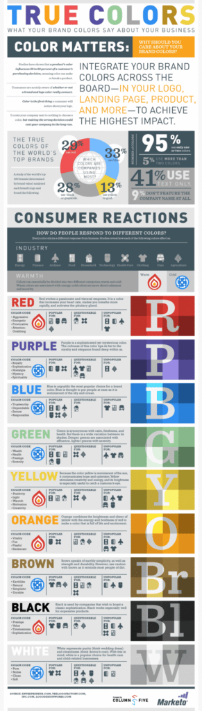 Popular healthcare industry colors, according to this resource, include: purple (royalty, elegance), blue (trustworthy, secure), orange (vitality, exuberant) and white (purity, cleanliness).
On the other hand, the color red (attention-getting, but visceral), and black have traditionally been avoided or questionable for medical. Similarly, this study suggests, surprisingly, that green (freshness, health), and, not surprisingly, brown (earthy, dirt) are questionable in health care applications.
I hasten to add that other references about the use of color in healthcare websites and advertising offer a different analysis. What’s more, the color palette for a primary care physician is likely to be different for a multi-specialty physician group, and different still for a community hospital.
Unfortunately, there are no universal, quick reference or textbook answers. Graphic design, including the use of color—in combination with dozens of other subjective and objective considerations—requires both professional training and experience to achieve marketing goals.
The big idea here is that color—often the first thing that a consumer notices about a logo, for example—is a significant influence factor among healthcare consumers. Color can influence Internet visitors. And color, according to consumer studies, is tied to consumer acceptance, increased brand recognition, and even in-office productivity.
For additional reference, notice how color is used in the various examples in our advertising portfolio pages. Also, click through to this article: Pretty Poison: When Graphics Kill Your Healthcare Marketing Message.
Simona Ramos, HSS Associate Creative Director