
Why a Good Infographic is Worth More Than a Thousand Words
 If you don’t include cave paintings (30,000 BC) or variations of ancient Egyptian picture writing (3200 BC), sometime in the 1960’s a blending of “information” and “graphic” produced the contemporary adjective INFOGRAPHIC. By definition, infographics are graphic, visual representations of information, data or knowledge.
Admittedly, our thumbnail profile oversimplifies the rich legacy of—by various names—information design, visual literacy and/or datavisualization. But the Internet has helped ignite a resurgence of interest and popularity in this highly effective tool for healthcare marketing and communications.
Infographic vs. text…there’s really no contest.
At the heart of it, it’s about input, retention and effective communications. About 90 percent of information transmitted to the brain is visual. Consequently, high quality infographics are 30 times more likely to be read than text articles. What’s more, they are inherently believable, and 40 percent of people respond better to visual information than text. Who says? Well—this Infographic-about-Inforgraphics says it’s so, and includes data sources (as good infographics should).
The clever folks at Social Media Chimps offer 6 Reasons Why Infographics and Data Visualization Works.
- Short Attention Spans: You’ve got two to four seconds to capture attention and inspire interest.
- Information Overload: Stand out in the Internet torrent of data.
- Easy to Understand: Visualizations simplify complex data.
- Reading Retention: People remember only about 20 percent of what they read.
- More Engaging: Graphics and design are visually compelling.
- People Love Sharing Infographics: A self-evident fact; see these six reasons in an infographic.
Other interesting and informative examples…
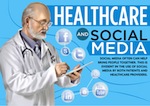
As further visual-food-for-thought, this infographic—from Master of Health Administration editors—illustrates the intersection of social media and healthcare.
And finally, you’ll want to see this unique interactive example from the UK. It has nothing to do with healthcare marketing, but Every Last Drop is worth a look at an infographic that cleverly adds motion to a storytelling presentation.
More about infographics in future posts. And if you have a hospital or healthcare marketing example that you’d like to share with readers and professional colleagues, please drop us a note or comment below.